Unfortunately with the iframe approach, you lack the ability to enqueue an access request prompt before Metamask has been installed. If you can use a cookie or localStorage entry to enqueue a request, then you don’t have to implement something like a refreshing iframe or interval retry logic which could potentially bug the user if they’re just rejecting the requests. I think if you implement the totally opaque approach, then it’s a must to implement a way of enqueuing a request before the extension is installed. As a general rule it’s bad practice in JS to implement polling logic instead of promises or event callbacks, this is the same principle.
A login cookie could also be added as an extension of this proposal (or as a subsequent extension), it seems like that could be a decent post-install way to instantly log-in.
Web3 browsers could also limit this annoyance by only showing up to a single login request from a given page, so even if a page was polling the request from within an iFrame (to effectively detect the extension’s installation), the user would only be prompted once.
This isn’t completely true. Brave provides a fingerprinting protection mode, a feature that we considered at MetaMask, but is actually impossible for extensions:
An extension’s contentscript is unable to make a synchronous query to global state (like whether or not a privacy mode is enabled) before a page loads. Chrome marked this concern a WONTFIX: https://bugs.chromium.org/p/chromium/issues/detail?id=54257
Without the option of letting a user opt into greater privacy vs not, minimizing fingerprintable surface seems to be the only option that is fully aligned with w3c’s fingerprinting guidance:
https://w3c.github.io/fingerprinting-guidance/
All that said, I do think there are pleasant design paths for this new pattern, they simply need to be explored. We shouldn’t necessarily reject this proposal just because existing patterns don’t work, we should consider whether other patterns could.
A Pleasant 1102 UX Proposal
An application following 1102 should have (1) a “Login” or “Get Started” button that triggers the 1102-specified login request.
If the user has a web3 browser, that web3 browser should (2) transition the view to the browser-provided login screen, ideally in a view that is either full screen or fully obscures the requesting website.
The website meanwhile should render (3) a view that assumes the browser is not web3 enabled, and should suggest installing one, or any other login patterns that are available. (This view is invisible to web3 browser users)
If the user approves the login, the website should immediately transition to (4) a logged in view, and the web3-browser using user should never see any assumption that they did not have a web3 enabled browser.
Extra Notes
If on view 3, the page suggests installing a browser extension (because a desktop browser is detected), the site could either recommend reloading the page after installation, or could use an iframe-polling hack to request login on a loop (this is working with a limitation of extensions)
If on view 3 the user rejected the login request, they will see the fallback login options, which makes sense and is a natural next step.
We’ll be posting wire-frames and a sample dapp to demonstrate this flow soon.
That brings me back to one of my earlier points
Wait for a user to try and do something and only after a user tries to interact with your dApp do you tell them they need something else.
That’s frustrating from the users perspective. They click “Login” and then they have to go install the extension, come back, remember to refresh the page, and then click “Login” again and hope they don’t need to do anything else
Taking a step back, there’s one main logic path that’s made more diffuclt by the total privacy detailed in 1102: handling users who have no dapp browser installed. As many have mentioned, this is an important UX consideration, especially because it directly relates to user onboarding.
There are a few options I see:
Option 1: Total privacy
The first option is to adjust current dapp UX around web3 detection to meet the requirements set forth in EIP-1102 as written today. This option provides total user anonymity on malicious sites, but makes UX more tedious because it relies on removing the ability for honest dapps to know if a user has a dapp browser installed.
To be fair, malicious sites knowing if a user specifically has a dapp browser installed means they can reliably associate IP addresses with Ethereum usage and run targeted ads, phishing campaigns, and other attacks. If a website detects it’s running in Chrome or some other non-dapp browser, these targeted attacks aren’t possible in the same way. This makes dapp browser detection funamentally more dangerous than regular browser detection, at least for the forseeable future where no Ethereum-specific API is baked into the DOM.
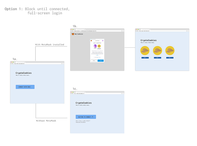
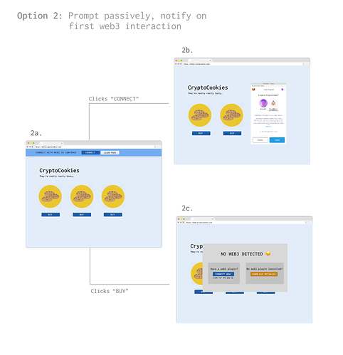
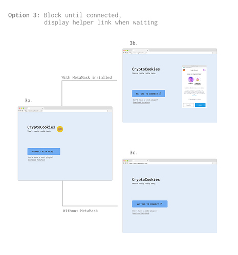
Some flows that we’re mocking up on our end that may work for this option:
-
Full-screen login (@danfinlay’s suggestion)
- Request a provider at any time (e.g. after button click)
- Dapp browser shows full-screen approval view
- Dapp renders non-web3 view behind approval view
- After success, dapp renders web3 view
- Example:
-
Dynamic reminder
- Request a provider on page load
- On first action requiring provider, check for it
- If provider undefined, inform user of approval / download requirements
- Example:
-
Constant reminder
- Request a provider at any time (e.g. after button click)
- Concurrently inform user of connection attempt / download requirements
- Example:
-
Timed reminder
- Request a provider at any time (e.g. after button click)
- Inform user of connection attempt
- After timeout, inform user of approval / download requirements
- Example: same as “constant reminder” above but download text only shown after timeout
Option 2: Minimally-fingerprintable API
It’s possible that total privacy shouldn’t be the end-goal of EIP-1102 and it should only serve to standardize restricted access to the provider / web3. If this looser approach is taken, dapps could still be informed if a user has no dapp browser installed or if a user rejects provider access, but dapps won’t be able to access anything beyond an error. This approach solves most UX concerns because existing flows that rely on knowledge of dapp browser installation are still possible, but has a major drawback in that it allows malicious sites to know if a certain IP address uses Ethereum.
While the original intention of the proposal was to provide complete privacy to stop the influx of targeted phishing and ad campaigns, maybe it’s sufficient to only restrict access to the provider / web3 and any useful information beyond knowing a user has a dapp browser.
Option 3: Do nothing
Another option is to maintain current behavior and continue injecting Web3 instances into every page a user navigates to. Dapps could continue to either use this environment-defined provider library or grab the provider from the Web3 instance and use it with their own library. This poses no UX issues at all since it’s the flow we have today, but also doesn’t address the major issues of 1) namespace collision from global injection, 2) the privacy issues of every site knowing about Ethereum use, or 3) every site being able to spam the user with web3 transactions.
I personally feel that we should find the best UX flow that satisfies option 1 above for the safety of Ethereum users. Any site knowing if a user is an Ethereum user (and in some cases their address) is like any site knowing the fiat bank a user may use (and in some cases their account number.) Still, I agree that current UX flows above are less than ideal (though the constant reminder as mocked up doesn’t seem too horrible), and I also don’t think a goal of total privacy should impede user adoption.
The wording “Login” seems like the frustrating part there. Maybe using something like “Get started” is a better UX, by better representing the app state.
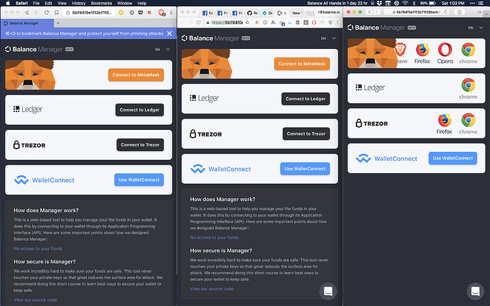
Just wanted to share some different states we have been adding for Brave, Chrome and Safari.
Helping people figure out why they need to use certain tools is a big hurdle.
I like the idea of connecting to something. Facebook Connect popularised that idea.
Another point of interest - maybe the level of web3 provider visibility should be a configurable option - maybe with the default being the low-fingerprint option discussed earlier? Best of both worlds approach.
I agree this approach would be a best of both worlds. It may be an option for other clients, but as a browser extension, MetaMask does not have an opportunity to synchronously access global user configuration before a page loads. This may be a target for change amongst browser vendors, but is our current reality.
Cross-posting this here for anyone not following the technical 1102 thread (an updated 1102 proposal that should alleviate most UX concerns discussed so far ):
Hello Ethereum Friends. I’ve been lurking on this thread for a few weeks now. Solid gold. I appreciate each and every one of you.
One thing that’s been bugging me is the potential confusion between “connecting your wallet” and “logging into metamask”. As I understand it by looking at Metamask’s source code, private keys are encrypted at rest and unlocked when a user logs in w/ their password. Post EIP-1102, Metamask will still be using a password-encrypted private key store. This means that simply clicking “Connect” in the provider access request screen will not be enough to give a dapp full access to the wallet. If that’s true, I’m unsure as to how they will manage this unlocking. We’re going to have to ask users to connect their wallet, then we’re gonna have to have text on our screens saying “looks like metamask is locked! go login!”
Am I missing something here?
Thanks!
Yes, under the latest proposal, calling ethereum.connect() will prompt the user to log-in, and when that call’s promise is returned, the user’s account should be available if the user connected.
That means while today you have to say “You’re unlocked, go unlock!”, under EIP 1102, you’ll be able to display a “Log in” button, which prompts the user to select an account, (and potentially eventually other specific challenges), and then makes the resulting account available to the App.
Ok so maybe I’m conflating this eip with metamask specifics too much. In a medium post by the metamask team, the request provider access screen did not have any place to type in a password.
Is the spirit of the spec that if they want to ask for a password to unlock a locally encrypted key store, it would be done in that request provider access screen?
Yeah, I think the spirit is that after calling ethereum.enable(), the wallet responsibly and with little friction gets the user to a point where they’re ready to use your app. That might involve unlocking, or if already unlocked, it might just be an account selection.
Ok thanks Dan. That helps a lot.
One last thing: I’m looking at the EIP on GitHub, and you mean ethereum.enable() not ethereum.connect(), right?
Yes, sorry, my mistake. Correcting/editing the post.
Please point me in the right direction if this is the wrong thread for this question. I have a UX issue after making the ethereum.enable() changes. How do you get the custom image in the new popup? In the article crypto kitties has their little kitty, but in my app I’m just getting an ugly domain name string. This article https://medium.com/metamask/https-medium-com-metamask-breaking-change-injecting-web3-7722797916a8
Hi @joshpitzalis, apologies for letting this slip through the cracks. MetaMask’s current implementation (which is now live in v5.0.0 of the extension) uses a given dapp’s favicon as the image on the approval popup. The actual UX of the popup isn’t codified in the underlying proposal, so there’s no specific API exposed to pass custom images to the popup (at least not at this point.)
Yup, that seems to be working. Thank you. I’ll see if I can upload a higher res favicon because its all blurry and pixelated.


