Hey, thank you for the feedback! I never thought about this even one sec ![]()
Let’s wait for the end of the vote, then I will try to refine the logo based on your recommendations. Maybe it’s just the white color that can seems a bit tendencious…
2 Likes
Hey @ninjafire,
Vote ended you have the first place, congrats ! Let me know if you have a successful attempt with the small modifications
3 Likes
Hi, i have worked on refining the logo based on your recommendations.
First, i tryed to modify the hat shape to follow the exemple you sent, move the small start to make it look hung at the end of the hat, and give the final result some colors.
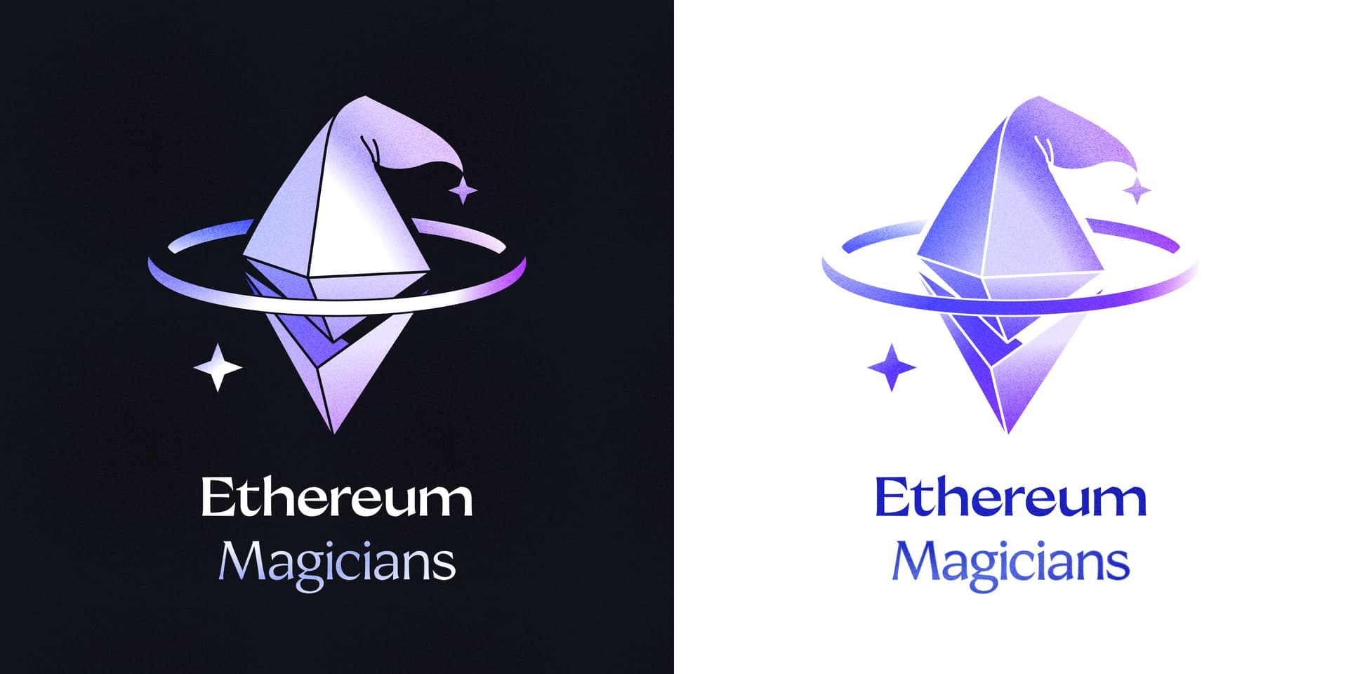
Secondly, I have tryed to create a proper element from the hat to put on top of the ethereum logo. On my side i feel it is crowded and the overall balance of the logo is lost. Let me know your thoughts on this.

4 Likes